
Having been out of action for a few weeks, I’ve had plenty of time to look around me at my home. The one we bought and did up twenty years ago, but haven’t really done much with since. It’s not exactly bold and beautiful.
by Prawny via depositphotos
A lot has changed in the last twenty years. I worked, was made redundant, struggled with unemployment, wrote a book, wrote a bunch more.
One of the reasons we decided to extend this house rather than buying somewhere new was to give me a dedicated workspace.
And I’ve been thinking about the new build – as I’m on the shorter side of the spectrum, tailoring it to my needs.
So with my forced rest, I’ve been reading Ingrid Fetell Lee’s, Joyful, in which she discusses the surprising effects of colour, texture, and space on our moods. It’s been fascinating.
Her blog post explains why we love some purchases for ever, but get bored of others in no time.
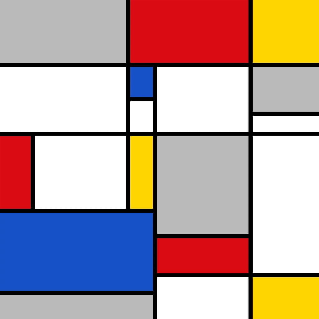
One of the reasons, is choosing bold and beautiful rather than lame and tame. We’re charmed by the bold and beautiful, but are afraid we’ll tire of them. We play it safe, but in fact, it’s the other way around!
Having looked more closely at my once fashionable, but now lame and tame beige decorative scheme, I can definitely say I’m bored with it.
Clothes and Cottages
In Signature Wardrobe Planning, I describe myself as leaning towards bright saturated hues. So you might wonder why my house is lame and tame in beige.
I do too.
Perhaps at the time I was more interested in fashion than a house that reflected my personality.
Right now grey is fashionable. Stepping aside from Fity Shades of Grey, it’s just not one thing or the other. Shades of ambiguity.
I can’t bear the thought of an overwhelmingly grey home. I imagine it would feel cold and clinical. I’d rather go black or white.
But why not choose bold and beautiful saturated colours against a backdrop of black or white? Given walls are pretty big, white’s probably better…
Though we’re in the middle of a global distribution crisis… It may be difficult to get tiles, couches or whatever in bold and beautiful, pure saturated colours.
But I’m going to try my best.